Data visualization is as much an art as science. There are many tools for producing visualizations in R. Some of the popular ones are ggplot and ggvis. Although ggplot is an amazing tool for creating static visualizations, it tends to fall short in performance when you need to create interactive data visualizations. Same is the case with ggvis. This is where plotly comes in handy. Plotly makes it easy to create rich interactive data visualizations without having the knowledge of either CSS or Javascript.

What is Plotly?
Plotly is a data visualization tool built on top of visualization libraries such as HTML, D3.js and CSS. It is created using the Django framework. It is compatible with a number of languages. The plots produced by plotly can be hosted online using the plotly API’s.
Advantages of Plotly:
● Easy to build visualizations using D3.js without knowing the language of D3.js
● Compatible with a number of languages
● The plots produced from Plotly can be hosted online so that other can access them
● Charts created by using Chart Studio which requires no coding, hence non coders can use them with ease
● The syntax for Plotly is simple
● Plotly is compatible with ggplot2 on R
Disadvantages of Plotly:
● Plots created using the community version of Plotly are accessible by everyone
● Limit on daily API calls
Building Interactive Data Visualizations using Plotly in R
As we have already looked at the advantages and disadvantages of Plotly. Let’s start building interactive data visualizations. First thing to do, install Plotly
install.packages("plotly")

Once the installation is complete, we need to call the Plotly library

> require(plotly)

Loading required package: plotly

Loading required package: ggplot2


Attaching package: ‘plotly’


The following object is masked from ‘package:ggplot2’: last_plot

The following object is masked from ‘package:stats’: filter

The following object is masked from ‘package:graphics’: layout
Before creating the graphs, let’s have a look at the syntax for creating the visualizations
plot_ly( x, y, type, mode, color, size)
Where –
● x = values for the x-axis
● y = values for the y-axis
● type = specifies the type of plot that needs to be created. Eg – ‘scatter’, ’box’ or ‘histogram’
● mode = the mode in which the plot needs to be represented
● color = represents the color of the data points
Scatterplot
Let’s start off by creating a scatterplot type from among our choices of interactive data visualizations. We will be using the iris dataset (resides within R, no need to load external file) to create the scatterplot. We attach the iris dataset and have a look at the first few rows. Also we will have a look at the structure of the data using glimpse from reply.
> require(dplyr)

> attach(iris)

> head(iris)

Sepal.Length Sepal.Width Petal.Length Petal.Width Species

1 5.1 3.5 1.4 0.2 setosa

2 4.9 3.0 1.4 0.2 setosa

3 4.7 3.2 1.3 0.2 setosa

4 4.6 3.1 1.5 0.2 setosa

5 5.0 3.6 1.4 0.2 setosa

6 5.4 3.9 1.7 0.4 setosa

> glimpse(iris)

Observations: 150

Variables: 5

$ Sepal.Length 5.1, 4.9, 4.7, 4.6, 5.0, 5.4, 4.6, 5.0, 4...

$ Sepal.Width 3.5, 3.0, 3.2, 3.1, 3.6, 3.9, 3.4, 3.4, 2...

$ Petal.Length 1.4, 1.4, 1.3, 1.5, 1.4, 1.7, 1.4, 1.5, 1...

$ Petal.Width 0.2, 0.2, 0.2, 0.2, 0.2, 0.4, 0.3, 0.2, 0...

$ Species setosa, setosa, setosa, setosa, setosa, ...
Looking at the data we can observe that there are four readings which are continuous, whereas species is categorical. The syntax to create a scatter plot is
> sca <- plot_ly(x = ~Sepal.Length, y = ~Petal.Length, type = 'scatter') > layout(sca, title = 'Scatter Plot', xaxis = list(title = 'Sepal length'),

+ yaxis = list(title = 'Petal length'))
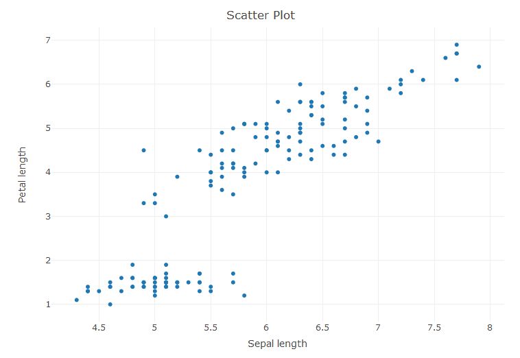
The layout command is used to define the title, xaxis and yaxis of the plot.
Let’s add some more layers to the plot by adding colors so as to differentiate the species from one another.
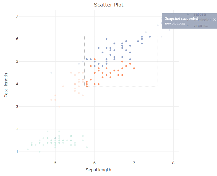
> sca <- plot_ly(x = ~Sepal.Length, y = ~Petal.Length, type = 'scatter', color = ~Species)

> layout(sca, title = 'Scatter Plot', xaxis = list(title = 'Sepal length'),

+ yaxis = list(title = 'Petal length'))
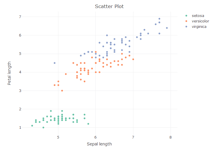
Now that the plot has been formed, we can –
- Zoom into the plot
- Reset the axis
- Do Box select, lasso select
- Download the plot as png
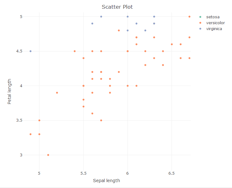
Let’s try to add the size variable to make the scatter plot display the readings for the Sepal length.
> sca <- plot_ly(x = ~Sepal.Length, y = ~Petal.Length, type = 'scatter', color = ~Species, size = ~Sepal.Length)

> layout(sca, title = 'Scatter Plot', xaxis = list(title = 'Sepal length'), yaxis = list(title = 'Petal length'))
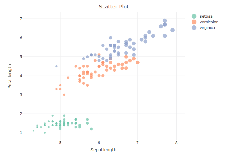
As seen from the above diagram the markers tend to increase in size as the reading for sepal length tends to increase.
Line Charts and Time Series
For creating the line charts we shall use the airquality data set
> attach(airquality)


> glimpse(airquality)

Observations: 153

Variables: 6

$ Ozone 41, 36, 12, 18, NA, 28, 23, 19, 8, NA, 7, 16, ...

$ Solar.R 190, 118, 149, 313, NA, NA, 299, 99, 19, 194, ...

$ Wind 7.4, 8.0, 12.6, 11.5, 14.3, 14.9, 8.6, 13.8, 2...

$ Temp 67, 72, 74, 62, 56, 66, 65, 59, 61, 69, 74, 69...

$ Month 5, 5, 5, 5, 5, 5, 5, 5, 5, 5, 5, 5, 5, 5, 5, 5...

$ Day 1, 2, 3, 4, 5, 6, 7, 8, 9, 10, 11, 12, 13, 14,...

> head(airquality)

Ozone Solar.R Wind Temp Month Day

1 41 190 7.4 67 5 1

2 36 118 8.0 72 5 2

3 12 149 12.6 74 5 3

4 18 313 11.5 62 5 4

5 NA NA 14.3 56 5 5

6 28 NA 14.9 66 5 6
Looking at the structure of the data, it can be seen that all the variables are of ratio/interval type. We shall be plotting the Solar.R values as a time series.
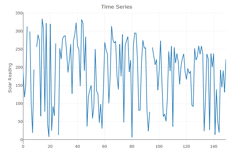
> ti <- plot_ly(y = ~Solar.R, type = 'scatter', mode = 'lines')

> layout(ti, title = 'Time Series', yaxis = list(title = 'Solar Reading'))
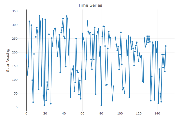
Let’s add markers to the above chart
> ti <- plot_ly(y = ~Solar.R, type = 'scatter', mode = 'lines+markers')

> layout(ti, title = 'Time Series', yaxis = list(title = 'Solar Reading'))
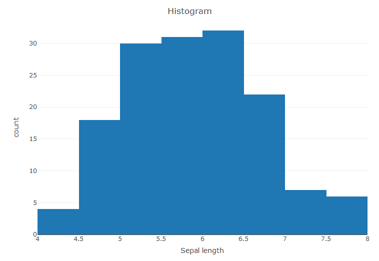
Histograms
Nextup we create histograms from the iris dataset. We use the Sepal Length to create the counts.
> #Histogram

> hist <- plot_ly(x = ~Sepal.Length, type = 'histogram') > layout(hist, title = 'Histogram', xaxis = list(title = 'Sepal length'),

+ yaxis = list(title = 'count'))
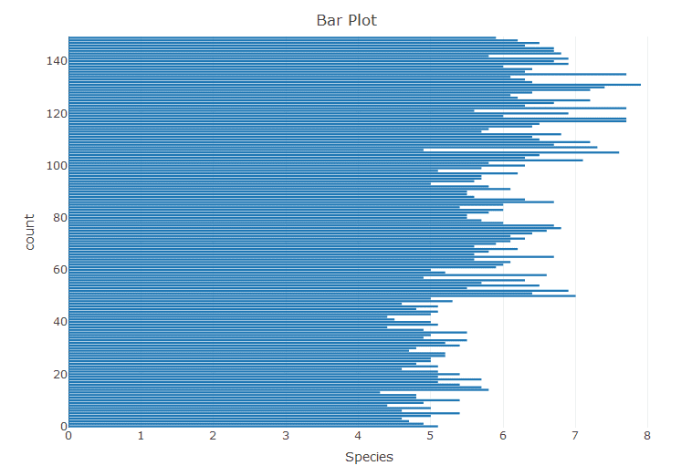
Bar Plot
With the iris data we create a bar plot.
> bar <- plot_ly(x = ~Sepal.Length, type = 'bar') > layout(bar, title = 'Bar Plot', xaxis = list(title = 'Species'),

+ yaxis = list(title = 'count'))
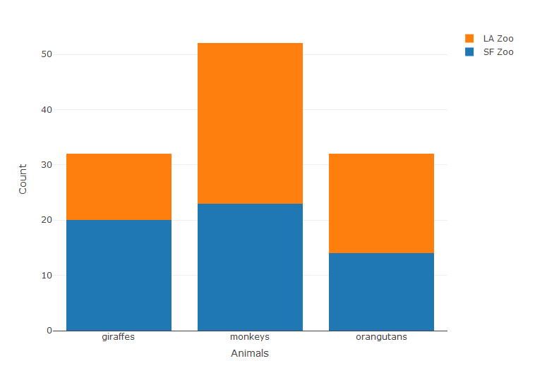
This is just a normal bar plot, we can create stacked bar plots. For this we create some custom data.
> Animals <- c("giraffes", "orangutans", "monkeys") > SF_Zoo <- c(20, 14, 23) > LA_Zoo <- c(12, 18, 29) > data <- data.frame(Animals, SF_Zoo, LA_Zoo) > data

Animals SF_Zoo LA_Zoo

1 giraffes 20 12

2 orangutans 14 18

3 monkeys 23 29


p <- plot_ly(data, x = ~Animals, y = ~SF_Zoo, type = 'bar', name = 'SF Zoo') %>%

add_trace(y = ~LA_Zoo, name = 'LA Zoo')


layout(p,yaxis = list(title = 'Count'), barmode = 'stack')
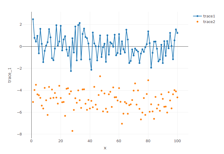
Line charts with Scatter plots
As we have already created both the Line chart and Scatter plots individually. It’s time to add both of these to create a single chart with both of these in one. To accomplish this we need to use the command add_trace. First let’s create some data.
> #Scatter plot with Time series

> trace_1 <- rnorm(100, mean = 0) > trace_2 <- rnorm(100, mean = -5) > x <- c(1:100) > data <- data.frame(x, trace_1, trace_2)
● trace_1 creates a random value from the normal distribution with a count 100 with mean zero
● trace_2 creates a random value from the normal distribution with a count 100 with mean negative five
The head of the data frame
> head(data)

x trace_1 trace_2

1 1 2.4854207 -5.067471

2 2 0.7854973 -3.974228

3 3 0.4401011 -3.496160

4 4 0.9688235 -4.369723

5 5 -0.6280533 -4.452010

6 6 1.6121642 -4.691630

> plot_ly(data, x = ~x, y = ~trace_1, type = 'scatter', mode = 'lines+markers', name = 'trace1') %>%

+ add_trace(y = ~trace_2, mode = 'markers', name = 'trace2')
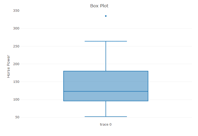
Box Plots
Plotly can also be used to create excellent box plots. Using the data from mtcars, we create a boxplot for the horse power values.
>attach(mtcars)

> glimpse(mtcars)

Observations: 32

Variables: 11

$ mpg 21.0, 21.0, 22.8, 21.4, 18.7, 18.1, 14.3, 24.4, 2...

$ cyl 6, 6, 4, 6, 8, 6, 8, 4, 4, 6, 6, 8, 8, 8, 8, 8, 8...

$ disp 160.0, 160.0, 108.0, 258.0, 360.0, 225.0, 360.0, ...

$ hp 110, 110, 93, 110, 175, 105, 245, 62, 95, 123, 12...

$ drat 3.90, 3.90, 3.85, 3.08, 3.15, 2.76, 3.21, 3.69, 3...

$ wt 2.620, 2.875, 2.320, 3.215, 3.440, 3.460, 3.570, ...

$ qsec 16.46, 17.02, 18.61, 19.44, 17.02, 20.22, 15.84, ...

$ vs 0, 0, 1, 1, 0, 1, 0, 1, 1, 1, 1, 0, 0, 0, 0, 0, 0...

$ am 1, 1, 1, 0, 0, 0, 0, 0, 0, 0, 0, 0, 0, 0, 0, 0, 0...

$ gear 4, 4, 4, 3, 3, 3, 3, 4, 4, 4, 4, 3, 3, 3, 3, 3, 3...

$ carb 4, 4, 1, 1, 2, 1, 4, 2, 2, 4, 4, 3, 3, 3, 4, 4, 4...

> #Box Plot

> box <- plot_ly(y = ~hp, type = 'box') > layout(box, title = 'Box Plot', yaxis = list(title = 'Horse Power'))
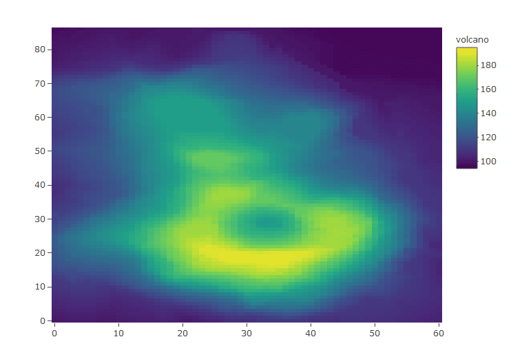
Heat Maps
Let’s start creating some more advanced interactive data visualizations with Plotly starting off with heat maps.For this particular exercise we will be using the volcano data set.
> #Heat maps

> data(volcano)

> glimpse(volcano)

num [1:87, 1:61] 100 101 102 103 104 105 105 106 107 108 ...

> dim(volcano)

[1] 87 61

> plot_ly(z = ~volcano,type = 'heatmap')
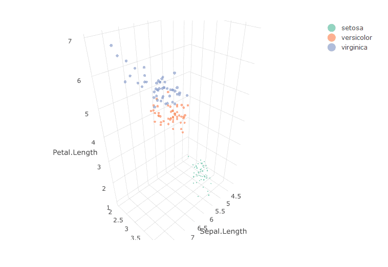
3D Scatter Plots
This is by far one of the coolest of interactive data visualizations tricks in Plotly. For this chart we shall once again use the iris data set. And define values for the three axises.
> #3D Scatter Plots

> plot_ly(x = ~Sepal.Length, y = ~Sepal.Width, z = ~Petal.Length, type="scatter3d", mode = 'markers',

size = ~Petal.Width, color = ~Species)
Conclusion
Reading through the article you must now be familiar with the working of Plotly in R. Plotly is used extensively in dashboards to create interactive data visualizations. It has an edge over ggplot in the interactive aspect, yet it can used along with ggplot to create plots to be pushed to the cloud. So, it’s time for you guys to go ahead and start creating awesome visualizations with Plotly.